Money in the 20th century was made of paper, metal and plastic. Now it has become purple, liquid and touch sensitive. Pocopay is a service for the European market that aims to change everyday banking forever.
A few months later he set up another meeting. This time he had a name: Poco, meaning “little” in Spanish. The service targeted the European market and was meant to change everything the banks are – big, slow, expensive.
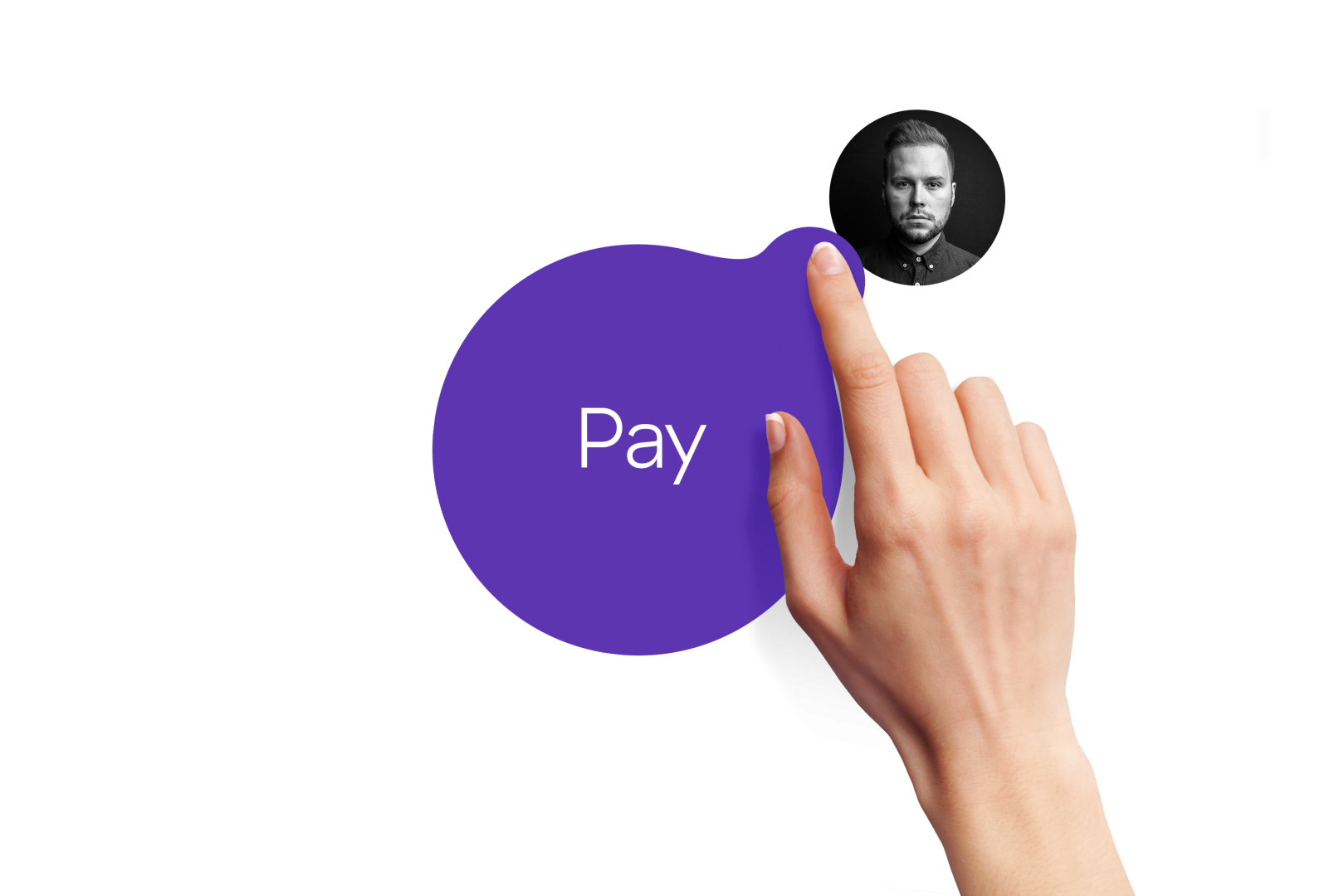
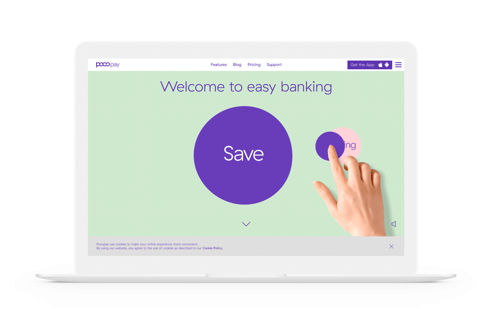
He already had some wireframes drawn up. These featured a big circle that was to become the central UX device, allowing users to drag and drop payments or requests. That sounded cool. We were in.
Our initial task was to develop the brand strategy, create a visual identity and help to implement it for the Android app. The solution was built on a brand new infrastructure independent from all the legacy systems in banking.

Firstly, we did some research on FinTech, analyzing both the offerings and visual language. We also spotted a few possible competitors from UK and Germany. Early on, it was clear that we already have something to set us apart from all the others.

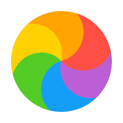
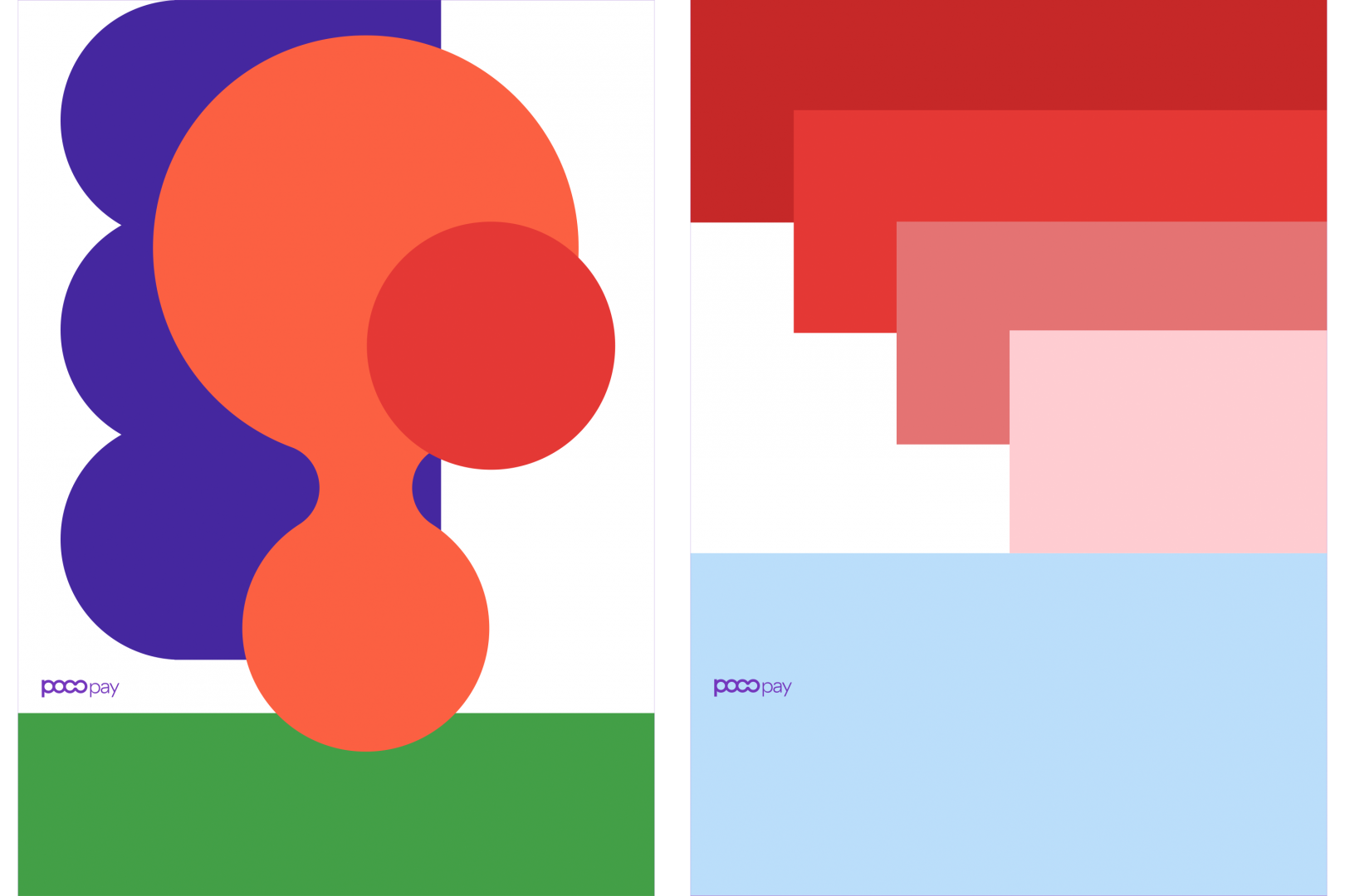
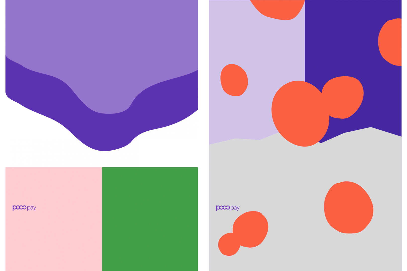
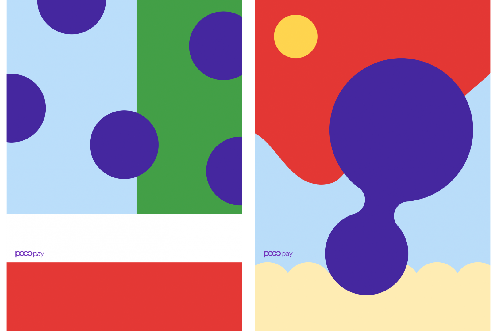
The currency circle. The “liquid currency” concept was central to the product and it made sense to built the visual identity around it, forming a coherent, strong system. We did explore some other avenues, but quickly returned to the circle.
Having set the main concept, it was pretty straight-forward. The name itself was a perfect fit as it’s letters can be constructed from 4 circles. It took some trial and error to get it right. At this point we agreed to change the name to Pocopay for clarity and ownability.

As the identity was meant to work not only digital-first, but mobile first, we designed the logo so it could be scalable with the icon integrated into the wordmark.
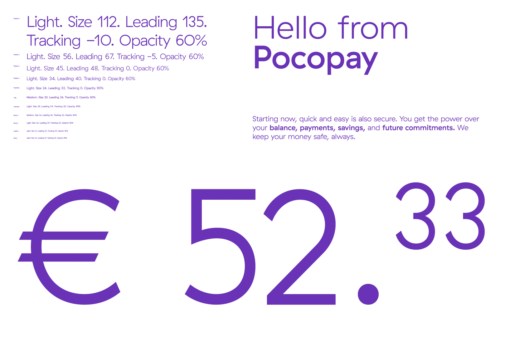
GT Haptik was chosen as the corporate typeface for its geometrical construction, on-screen legibility and nice-looking numbers. We also knew that if modifications would be needed the guys at Grilli Type will always help us out. More on that later.
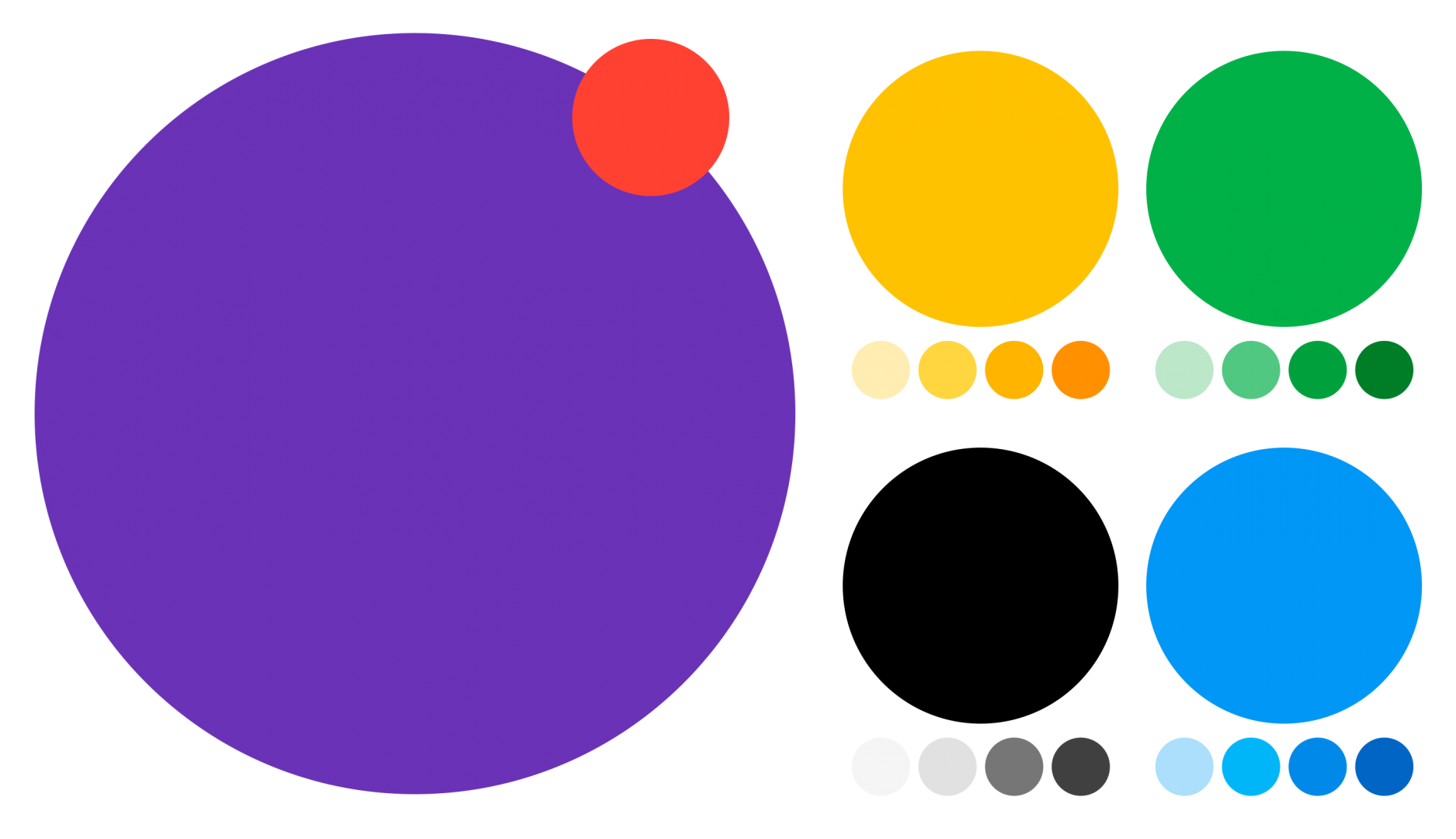
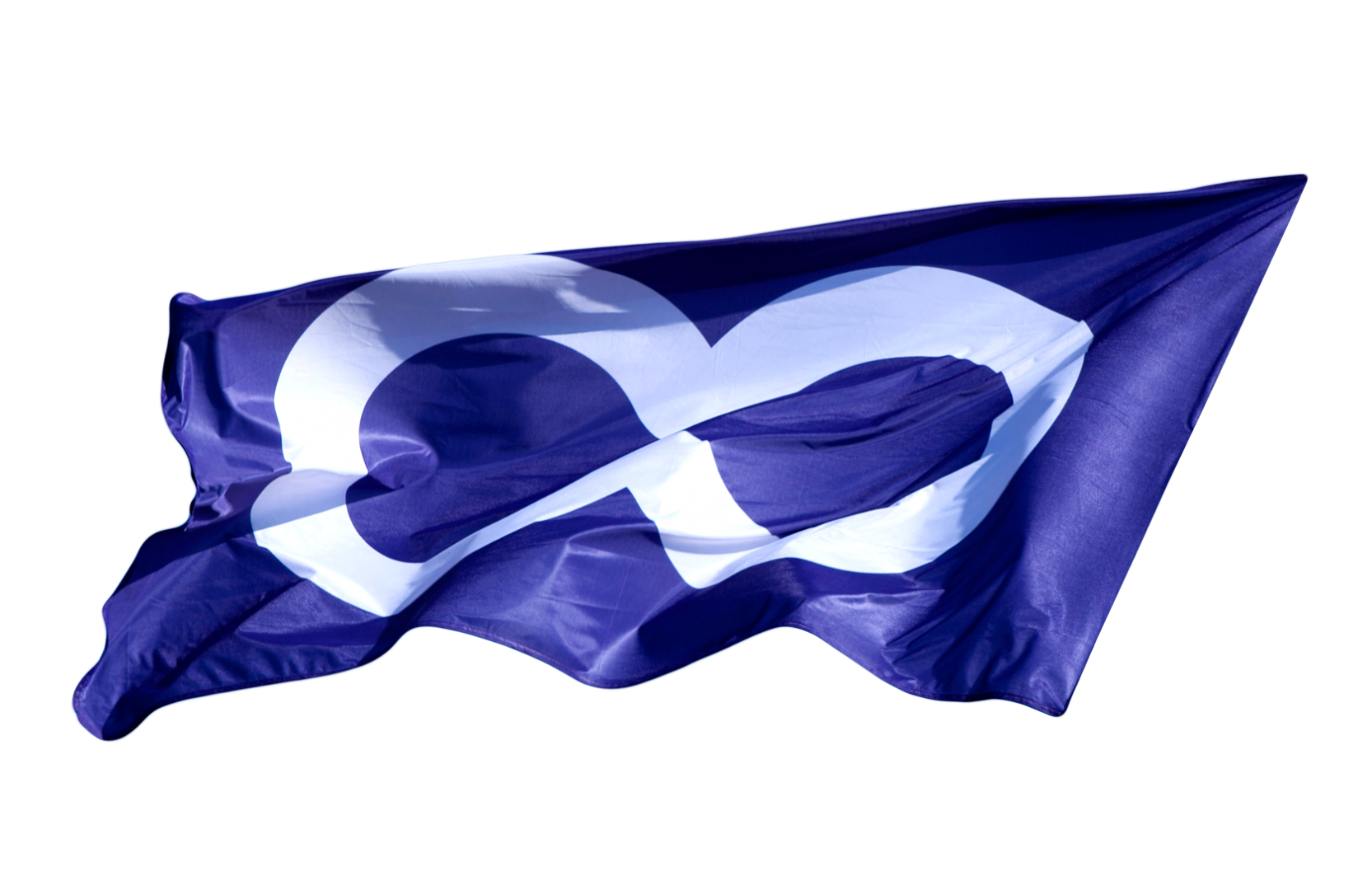
For a strong brand presence, one core colour can work wonders. We settled on purple. It was not used by any competitors (or anybody in FinTech) and it certainly did not leave anybody cold. As we soon found out while preparing some investor pitches for the CEO, Indrek Neivelt. A secondary colour palette was chosen based on the core features of the app.
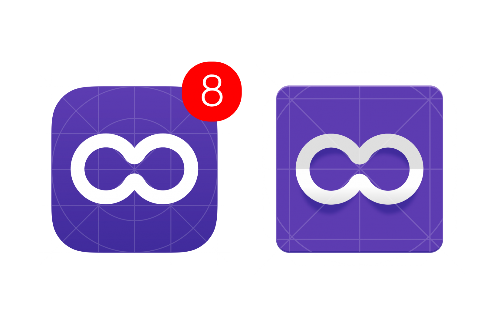
App icons for iOS and Android.
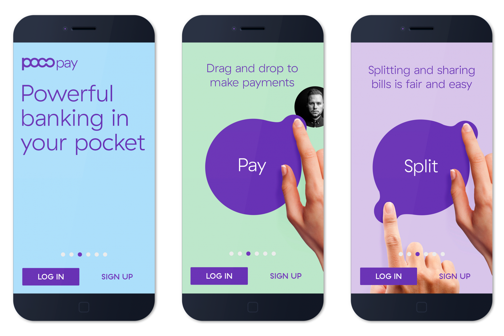
Several concepts for the start screen.

The currency circle was meant to be a fun, almost tactile experience. But how would it actually perform, how liquid would it be (we talked frozen vodka vs jelly here, btw) and can the developers actually make it work? We had to find out. Here is the first concept for liquid motion animation.
Warning: Undefined array key 1 in /data01/virt89877/domeenid/www.aku.co/htdocs/wp-content/themes/aku-co/templates/content-single-projects.php on line 122
Final renders with each animation describing a feature through a liquid metaphor. Animation by Tolm.
Warning: Undefined array key 1 in /data01/virt89877/domeenid/www.aku.co/htdocs/wp-content/themes/aku-co/templates/content-single-projects.php on line 122
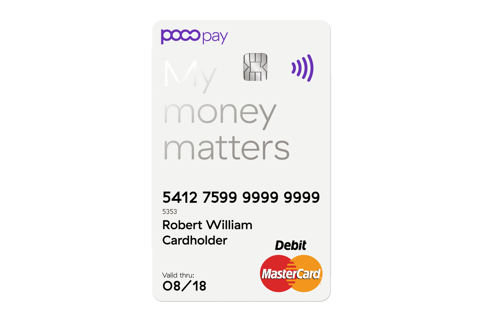
Besides the usual stationary package, one of the first deliverables was a bank card. Here we asked ourselves the obvious question: “Why is the design on the card placed horizontally, when in actual use you hold it vertically?” A few tries and yes, a vertical design actually works.
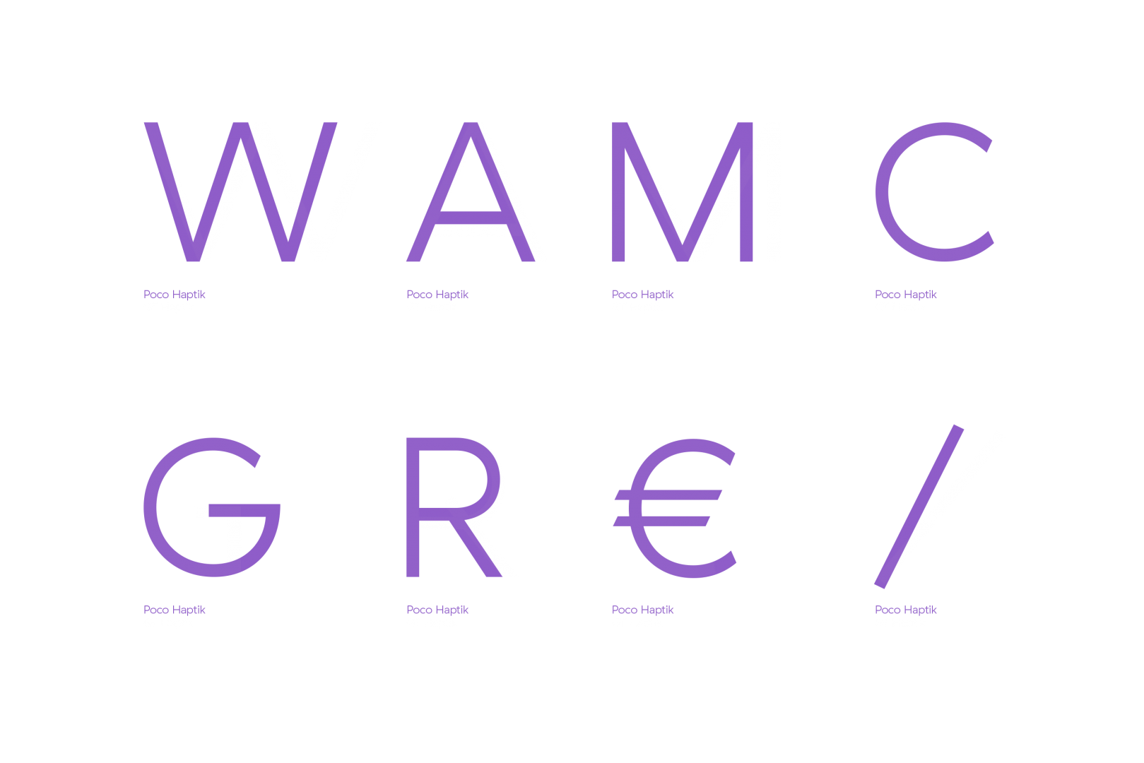
However much we liked GT Haptik, it was not perfect. The uppercase letters were too wide for in app use and it had some quirky features that needed toning down. So we worked with Grilli Type to create a custom version. A special tabular-only typeface was added to be used for bank statements and other features inside the app.
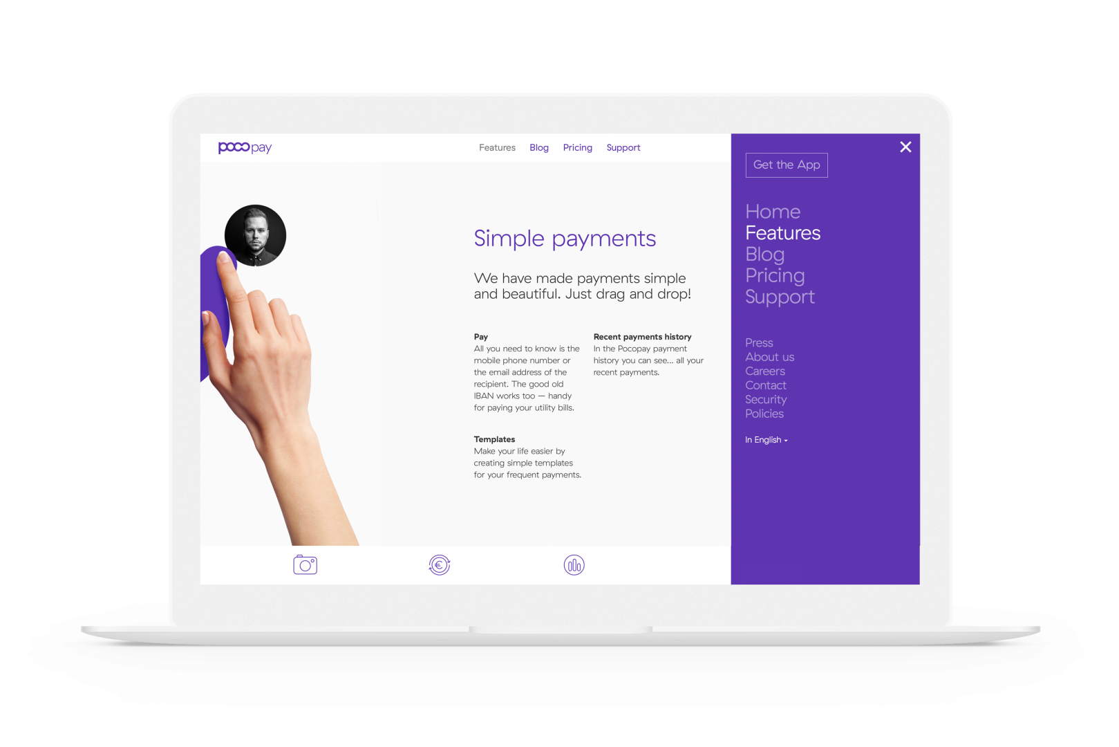
Another huge part of the project was the website. From outlining the content to design and development, it was all done in less than 2 months. The site was launched from the back seat of a taxi. True story.
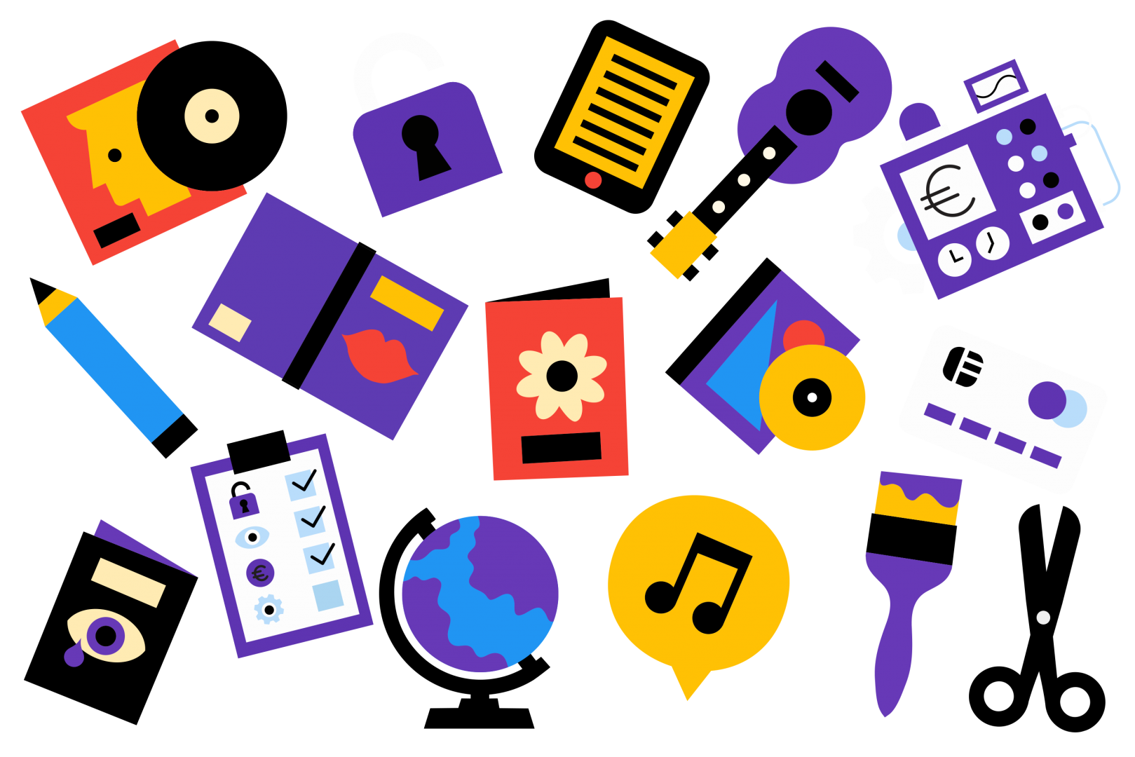
The website needed illustrations. We turned to our trusted friend Ryan Chapman as his simple, colourful style worked so well with the identity.
A week before the launch event we realized that the venue is looking too bleak. So we asked designer/illustrator Carl-Robert Kagge to play around with the identity and come up with 6 custom artworks. These were printed in A0, framed and displayed. 5 of them now adorn the walls of Pocopay offices. The 6th? Yes, we got to keep that.