Nortal

Estonia has the most advanced digital society in the world. This is the result of forward-thinking public sector working closely with companies like Nortal, a strategic change and technology firm with offices in 6 countries, employing over 600 people.

Client: Nortal
Illustrator: Ryan Chapman
Year:
 2016

loader

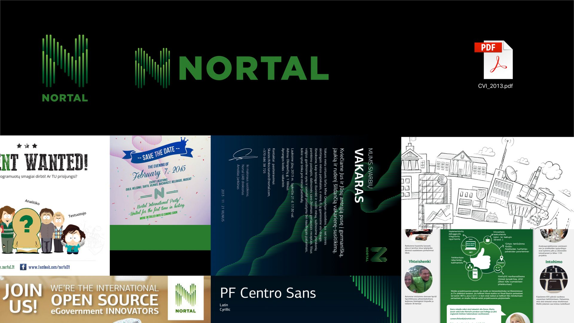
The Nortal brand was introduced in 2012, after the Estonian Webmedia Group bought Finnish-owned CCC Corporation. The name is derived from “Nordic values” and “Talented professionals” and the original identity was developed by Identity. It centered around a stylized image of nordic lights on a dark background.

loader

Early 2015 we received a brief from Nortal, outlining the need for a rebrand. They had realized the black backgrounds did not work for both cultural and practical reasons. In Middle-East, black is considered the colour of death and should be avoided. The application of the brand was difficult, several guidelines were partial or missing.

We started with talking. 20 interviews with all the main stakeholders and regular employees brought up more problems, some of which needed addressing fast. People were mostly struggling with their everyday tasks – documents and presentations. So we outlined a startegy of building the basic visual elements and quickly implementing them.

loader

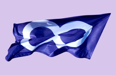
Then came the inevitable: “You can change anything but the logo”. It needed some convincing that a strong identity can be built coherently without losing contact with the past. We simplified the shape of logomark and introduced a new typographic solution. The logo is constructed to remain pixel-perfect and sharp even at small sizes.

loader

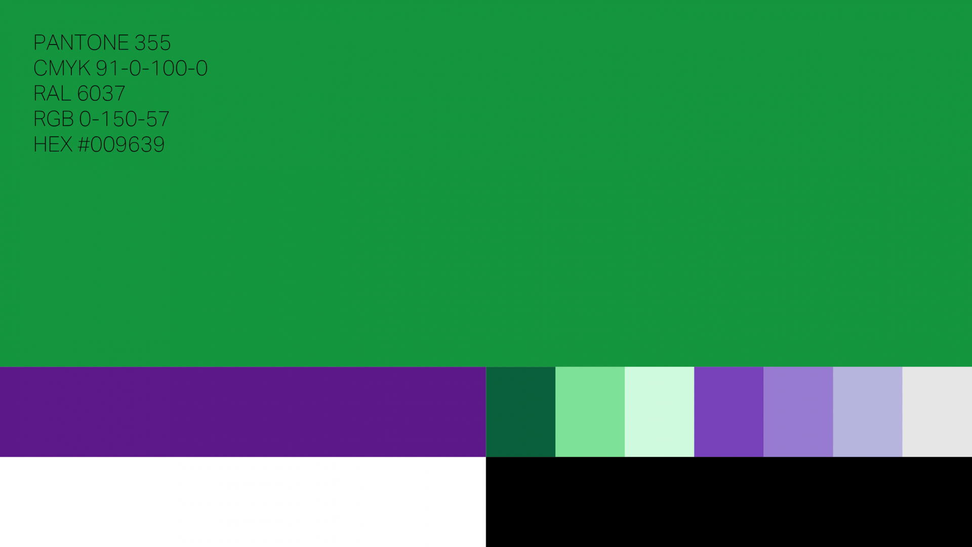
With black gone, green was to take center stage. It was turned a tad brighter and now works across all the needed colour spaces (yes, even RAL). Purple was chosen as the secondary colour with a set of complimentary hues added. It took a lot of testing on MS Office and using a beat-up projector to get them all working side by side.

loader

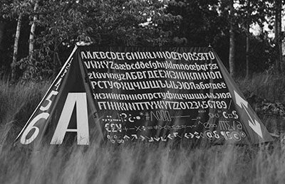
Although the previous typeface (PF Centro Sans) included Cyrillics, a true polyglot was needed. With a lot of Nortal’s business in Oman, we looked for a typeface that could also support Arabic script. Say hello to Aktiv Grotesk. With Chinese, Japanese and Korean language support, it makes for a truly future-proof solution. It looks damn nice too.

loader

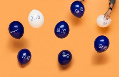
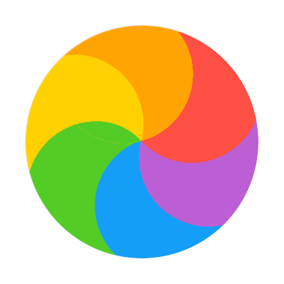
A simple and modular pattern was derived from the logomark.

loader

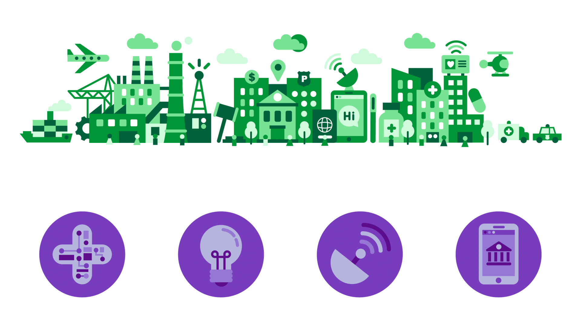
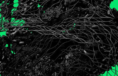
As a “seamless society” still does not exist, Ryan Chapman got the task of envisioning it.

loader

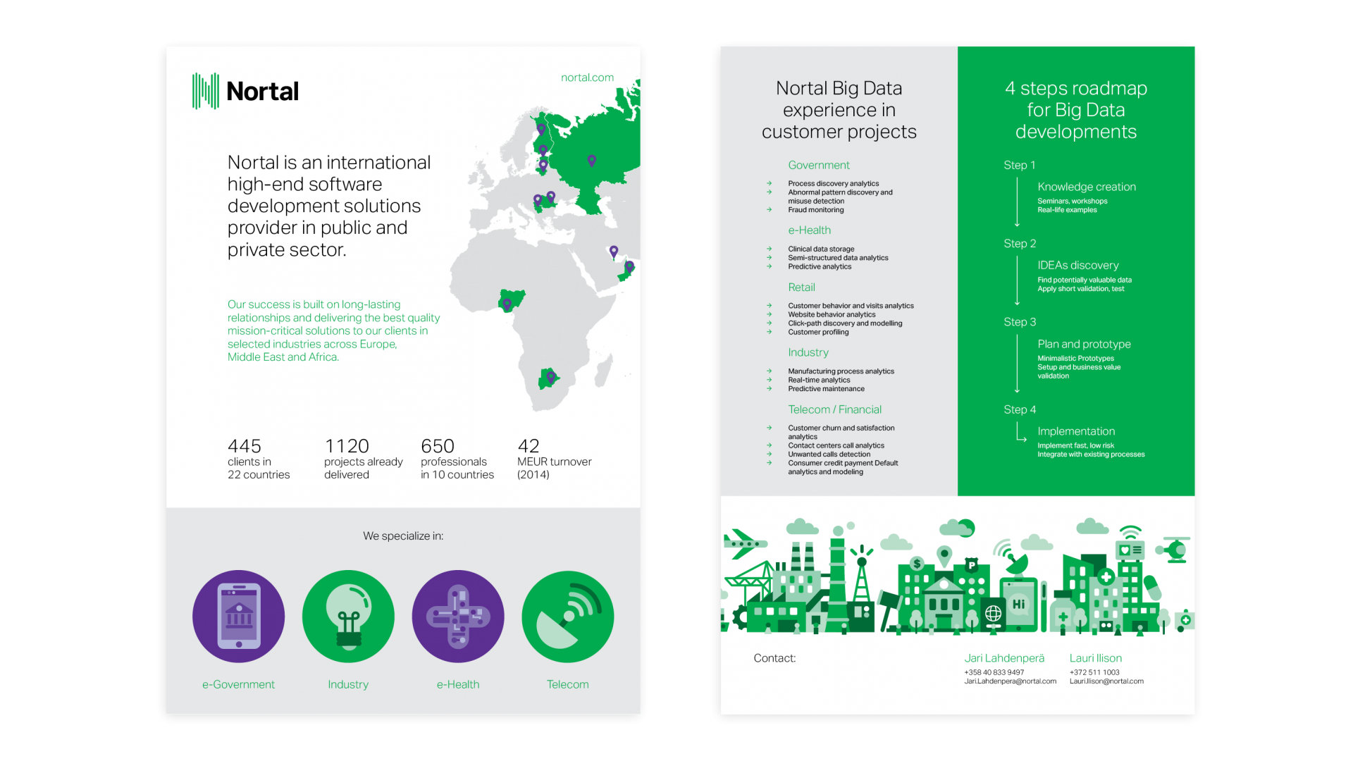
We designed a lot of templates. As they tend to be boring to look at, we’re just showing these 2.

loader

With offices (and designers) all over the world, a pdf CVI just would not cut it. A custom web-based brandbook was the way to go.

Contact

AKU Collective OÜ
Pagari 1 – 4, Tallinn 10133, Estonia
info@aku.co

+372 518 8402
VAT: EE101524281
Reg nr: 12224294

Behance
Facebook
Tumblr

Team

Alari Orav
Designer / Partner
alari@aku.co
+372 518 8402
LinkedIn

Uku-Kristjan Küttis
Designer / Partner
uku@aku.co
+372 5560 7782
LinkedIn

Johann Kabonen
Designer
johann@aku.co
LinkedIn

Mirjam Reili
Designer
mirjam@aku.co
LinkedIn

About

We are forward-thinking designers who love interesting problems. Our work starts with a simple “why?” and follows a tailor-made process, involving both reason and intuition. We aim to provide meaningful, honest and surprising solutions.

AKU was founded in 2012 by Alari Orav, Kaarel Kala and Uku-Kristjan Küttis, who share over 40 years of combined experience in design and communication. We have worked with a wide range of clients from long-standing institutions to fresh start-ups, both locally and internationally.

Selected clients

Huffington Post
Click & Grow
Connected Health cluster
Eliko
Estonian Centre of Architecture
Estonian Design Centre
Estonian National Museum
FC Flora
Joon
Kokomo
KTA Architects
Mondo NGO
Nortal
Parliament of Estonia
Pocopay
Pühaste Brewery
Salto Architects
Tallinn City Theatre
Tallinn Music Week
Union of Estonian Architects

Awards

We have received over 20 Estonian Design awards, including ADC*Estonia Designer of the Year, Young Gun and a Grand Prix.

Full Award List

Capabilities

Branding
Strategy
Naming
Visual Identity
Art Direction
Packaging

Environments
Signage/Wayfinding
Exhibition Design

Print
Books
Periodicals

Digital
Web and App Design
User Interface Design

Estonian Design Awards
ADC*E Designer Of The Year — Uku Kristjan Küttis, 2014
Silver — Tallinn Architecture Biennale 2013 Catalogue, printed works. 2014
Silver — Exhibition Estonian farm architecture, exhibitions 2014
Shortlisted — Tallinn Architecture Biennale 2013, corporate identity, 2014
Bronze — Tallinn Music Week, corporate identity, 2014
Bronze — SISU poster, printed works, 2014
Antalis Best Use of Paper — Sisu poster, 2014
Gold — European Parliament Elections 2014, Broadcast Environment, 2014
Bronze — European Parliament Elections 2014, Broadcast Identity, 2014
European Parliament Elections 2014, Broadcast Identity, 2014
Silver — Tallinn Architecture Biennale 2011 identity, 2012
Silver — Rótary Klubi, printed matter, 2012
Bronze — ETV Channel Identity, 2012
Shortlisted — Kaleidoskoop poster, printed matter, 2012

ADC*Estonia
Silver — Kohvik August, corporate identity, 2015
Bronze — Music Estonia, corporate identity, 2015
Bronze — SISU 2015, printed works, 2015
Bronze — Tallinn Music Week 2015, illustration, 2015
Shortlisted – Joon, corporate identity, 2015
Shortlisted — Tõnis Saadoja exhibition, printed works, 2015
Bronze — Estonia 100 branding, corporate identity, 2013
Shortlisted — Estonian Design Awards 2012, corportate identity, 2013
Shortlisted — ZEN pre-paid phone card, corporate identity 2013

BalticBest
Silver — European Parliament elections, design, 2014